The Epic Marketing Campaign Behind 'House of the Dragon': Inside HBO's $100M+ Push to Launch the Next 'Game of Thrones
The marketing campaign for "House of the Dragon" was one of the largest in HBO's history!
The marketing campaign for "House of the Dragon" was one of the largest in HBO's history, with CEO David Zaslav calling it "the biggest campaign in HBO history." This investment aimed to recapture the massive audience that followed "Game of Thrones."
The show's premiere was the most-watched series debut in HBO history, drawing nearly 10 million viewers across all platforms. This success was attributed to a massive marketing campaign, including numerous engaging activations and a dynamic AR app that allowed fans to raise their own dragons.
The marketing push was not limited to the United States. It was also the most impressive launch for HBO Max in Latin America and the EMEA region, which includes Europe, the Middle East, and Africa.
The show's social media accounts were active in promoting the series, with posts about the show's characters, behind-the-scenes looks, and fan interactions. This helped to build a community around the show and keep fans engaged.
The marketing team made a concerted effort to engage with fans, both online and in person. They held several fan events, including a premiere event in New York City, and encouraged fans to share their thoughts and reactions on social media.
Despite some initial skepticism, "House of the Dragon" proved to be a hit with audiences, drawing strong viewership numbers throughout its first season. This success is a testament to the effectiveness of its marketing campaign, which helped to build excitement and anticipation for the show.
Sources:
- "House of the Dragon: How HBO's Game of Thrones Prequel Became a Massive Hit" by The Hollywood Reporter
- "House of the Dragon: The Marketing Campaign That Reclaimed the Iron Throne" by Adweek
- "House of the Dragon's Record-Breaking Premiere Draws Nearly 10 Million Viewers" by Variety
- "House of the Dragon's Global Success: A Marketing Triumph" by Deadline
Branding
The font used in "House of the Dragon" is a custom design by Måns Grebäck, a Swedish type designer. The font, also named "House of the Dragon," is a gothic blackletter typeface that draws inspiration from medieval manuscripts and early print typography. It's characterized by its ornate, decorative style, with a mix of uppercase and lowercase letters that create a sense of grandeur and drama.
The font is used extensively in the show's promotional materials, including posters, trailers, and the opening credits. It's a bold choice that effectively captures the show's medieval fantasy setting and the epic, high-stakes drama of the story.
The font is available for personal use and can be downloaded from various font websites. It's also used in the show's merchandise, such as t-shirts and posters.
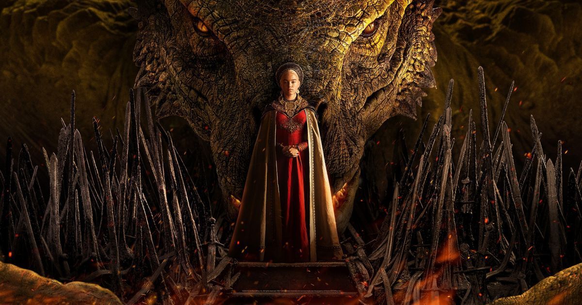
As for the branding of "House of the Dragon," it's closely tied to the font and the visual style of the show. The show's logo, which features the title in the custom font, is a key part of its branding. The logo is often displayed against a dark, textured background, which gives it a sense of depth and richness.
The show's colour palette is also a key part of its branding. It features a mix of deep reds, golds, and blacks, which evoke the show's themes of power, royalty, and conflict. These colors are used in the show's promotional materials, as well as in the show itself.
The branding of "House of the Dragon" is designed to appeal to fans of "Game of Thrones," the show's predecessor. It uses similar visual elements and themes, but with a distinct medieval fantasy flavor. The branding is a key part of the show's marketing strategy, helping to build anticipation and excitement among fans.
Overall, the font and branding of "House of the Dragon" are a testament to the show's high production value and attention to detail. They effectively capture the show's medieval fantasy setting and epic, high-stakes drama, and are a key part of its marketing strategy.

